As you probably know I went to Canada a month ago for spring break.
The main reason I loved my short trip so much is because it was a few days that I could complete devote to photography.
Even though I consider photography one of my biggest hobbies/passions I hardly ever experiment with my camera! I find a mode/way of shooting I like and I stick to it.
This trip was different. Although I've probably been to Canada 25 times in my 20 short year of life, I had never been in March (or early spring/spring at all).
Everything looked completely different from the winter and summer months.

I was shocked to discover how unusually colorful yet insanely dull all of the nature looked. Does that concept make sense?
For example one moment I'd goes outside and the world was blanketed in gray and beige; however, I'd walk for 10 minuets and the forest floor would be glowing with neon mosses and fungi. It was so so so so perfect for my photographing escapade!
(So if you like the pictures don't credit me credit mama earth....)
((Actually please don't steal my pictures credit us both))
I'm usually a really heavy shooter and take tons of photos that I then edit down later, but this trip I carefully selected each photo I took (I tried to channel my inner film photographer self).
The result of this was I got a lot more pictures I liked; however it was so impossible for me to edit down on my computer and ya know...post 10-15 Canada photos like a normal person....I feel so attached to them all.
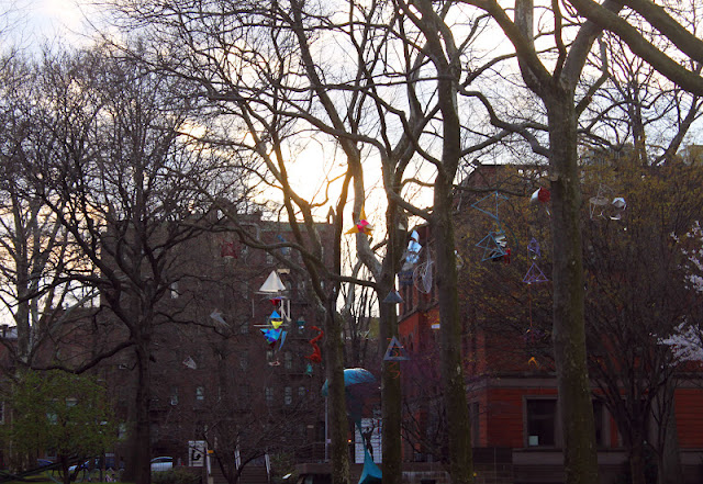
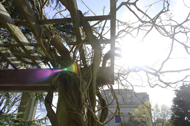
Even though I took multiple cozy naps by the fire, ate towering seafood feasts, wore Native American moccasins and Irish knit sweaters (like a mo-fo), and lived a pretty aesthetically pleasing indoor life I mostly saved my picture taking for outside. AKA the pictures below don't have that much variety. They are about 75% trees 10% moss 10% ponds and 5% rocks.
I always think that a huge part of being a good photographer (or artist at all for that matter) lies in the way you present your work. I always admire blogs and websites where the photos are carefully chosen and presented in a clean, simple, narrowed down way...I'm so bad at doing this...if anyone has any tips please tell me HOW...literally whenever I have to send out my portfolio for a job it always has like 70 too many slides because I just can never choose WHAT THE HECK to include and not to include.
So I created a read more tab...as to not overwhelm the blog with too pictures of beaver dams and buoys. I would be so honored/happy if people actually did click 'read more' and told me what they thought. I'm pretty pleased with this little body of nature/landscape photo work.


